Colors do more than just decorate—they shape how we feel in our homes. Understanding Color Psychology in Interior Design: Choosing the Right Palette for Your Space can turn any room into a place that lifts your mood or helps you relax. This article dives into picking colors wisely, even on a budget.
What Is Color Psychology?
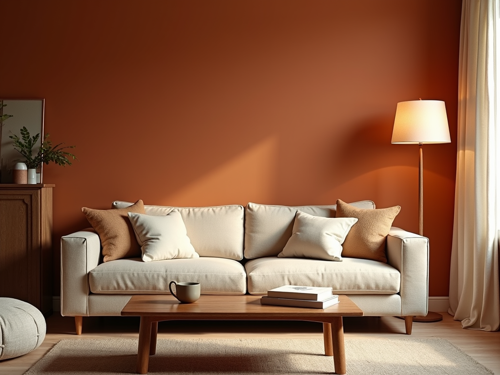
Color psychology looks at how colors affect our emotions and actions. In interior design, it’s a tool to make spaces feel right. Blue can calm you down, perfect for a bedroom. Red gets you talking, great for a dining room. Knowing this helps you choose colors that match your needs.
I learned this the hard way in my first apartment. I painted my living room bright yellow, hoping for a cheerful vibe. Instead, it felt loud and stressful. Turns out, yellow can overstimulate. I switched to a soft green, and suddenly, the room felt like a peaceful escape.

How to Pick the Perfect Palette
Choosing colors isn’t just about what you like. Think about the room’s purpose, how much light it gets, and its size. In small apartments, light colors open things up. Darker shades can make a room cozy, but they might shrink it if overdone.
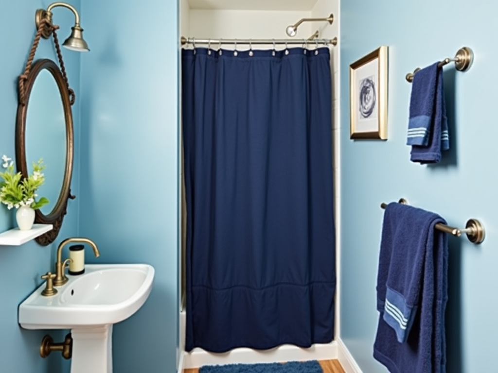
Here’s a trick I love: stick to one color family. Use different shades of the same color—like light blue walls with darker blue curtains. It ties the room together and makes small spaces feel bigger. I did this in my bathroom, and it’s like a mini spa now.
Frugal Decorating Tips
You don’t need a big budget to use color psychology. Here are some Frugal Decorating Tips:
- Paint Smart: A can of paint is cheap and changes everything. Pick a mood-setting color.
- Add Accents: Throw pillows or a rug in bold hues add life without costing much.
- DIY Fun: Paint old frames or jars to match your palette for a custom look.
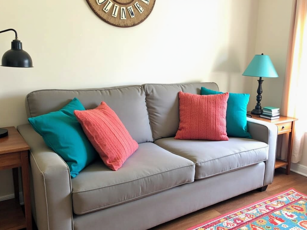
When I moved into my last place, I couldn’t buy new stuff. I grabbed a plain secondhand couch and tossed on teal and coral pillows. Those pops of color made the whole room feel fresh and intentional, proving budget-friendly decor works.
Real-Life Lessons
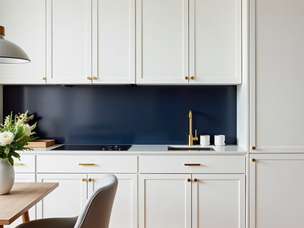
One thing I’ve noticed: people often miss color undertones. Warm or cool tones matter. My friend paired warm wood floors with icy gray walls, and it clashed. Switching to a warm beige fixed it. Match undertones for a smooth look.
Another tip—don’t overdo the colors. Too many shades confuse the eye. I once tried a rainbow vibe in my kitchen, and it was a mess. Now, I stick to 2-3 colors max. It keeps things clean and calm.
Budget Ideas for Small Spaces
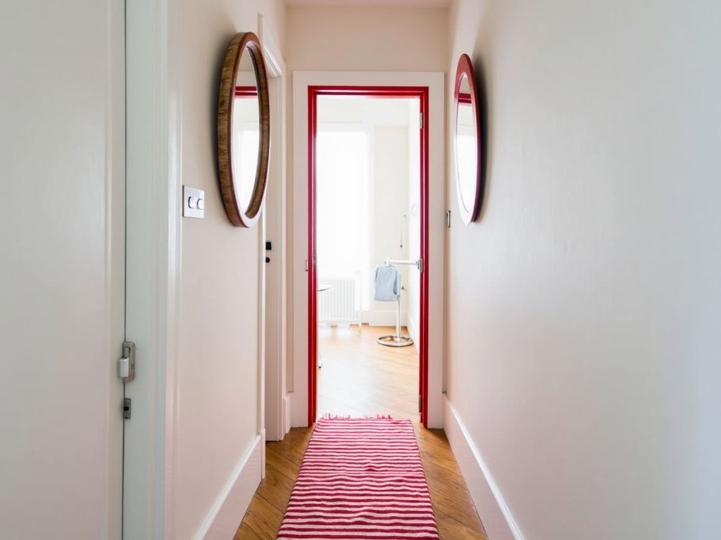
For frugal decor ideas for small apartments, color is your friend. Paint an accent wall to add depth without clutter. Use mirrors with colored frames to bounce light around. I hung a thrifted mirror with a red frame in my hallway—it opened up the space for pennies.
You can also play with patterns. A striped rug in your palette’s colors adds style without breaking the bank. I found one at a yard sale for $5, and it’s now the star of my living room.
Wrap-Up
Using Color Psychology in Interior Design: Choosing the Right Palette for Your Space lets you craft a home that feels good and looks great. Pick colors based on the room’s job, light, and size. Mix in budget-friendly decor like paint and accents, and you’ve got a winning combo. Try it out—you’ll see the difference.